Favocity
A social app for food enthusiasts that are always in a hurry
- Client: Jared Company
- Industry: Lifestyle
- Platform: iOS
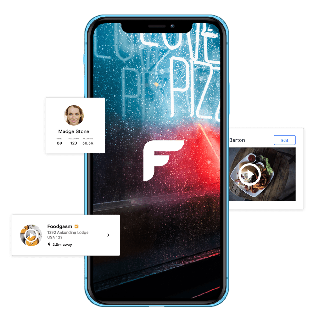
The Problem
A year after its release, Favocity looked and felt outdated.
It stopped attracting new users.
The Jared Company decided to freshen-up their app.
They asked us to make a new design and features for it.
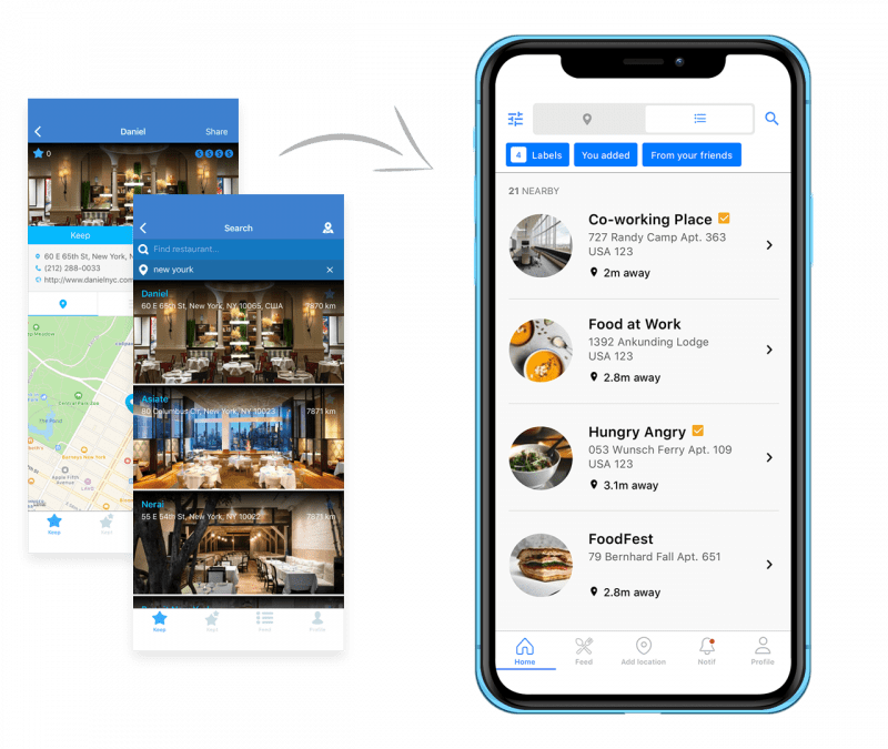
The Work
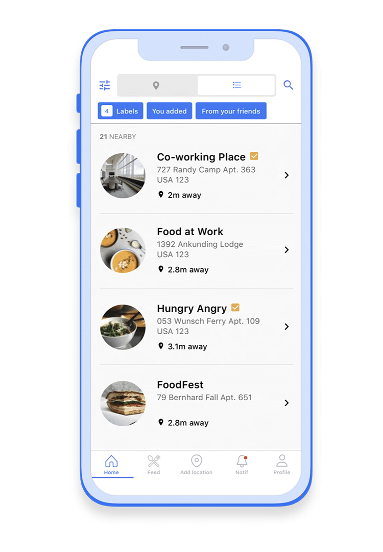
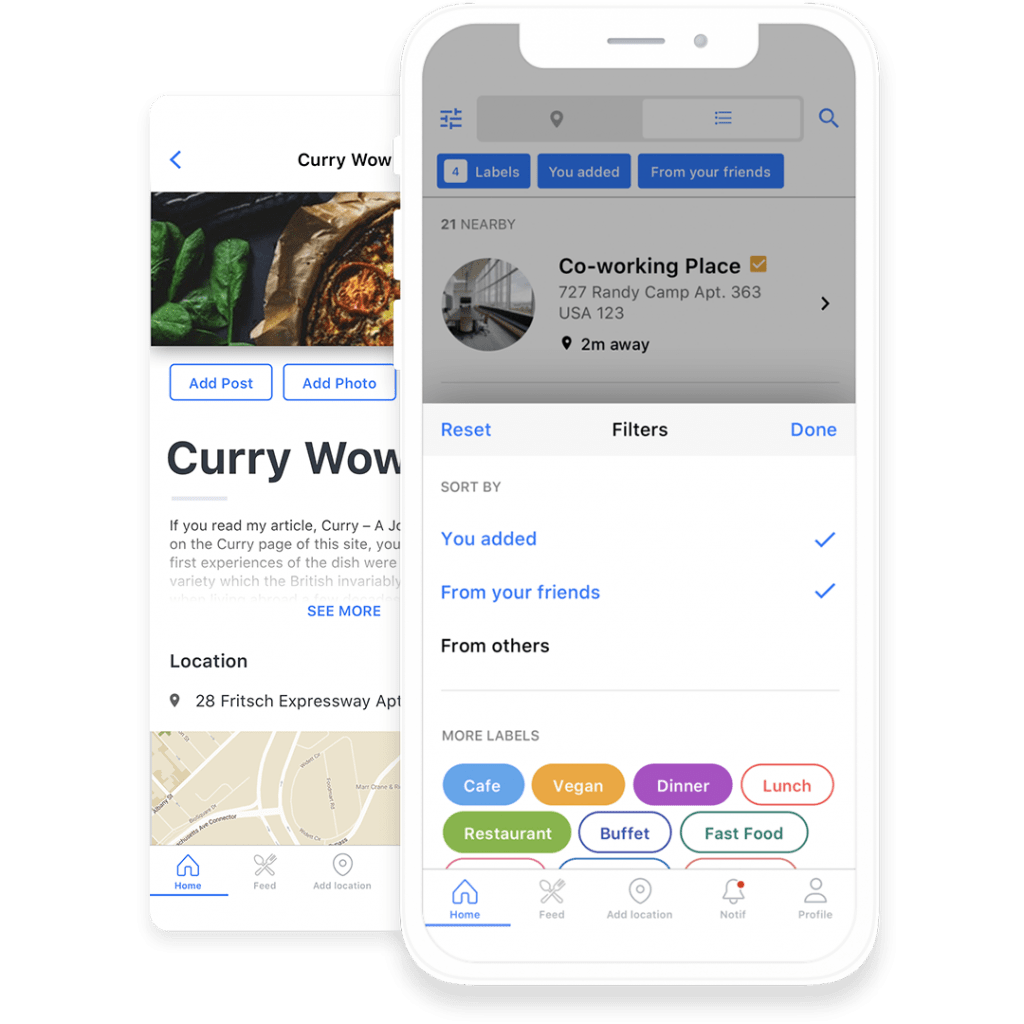
We changed how Favocity looked and gave it some new features. The new app has a global map with all saved places, a sorting tool with labels, and more social interactions. We also took care of the old users and used universally recognizable icons to help them adapt to the new features.
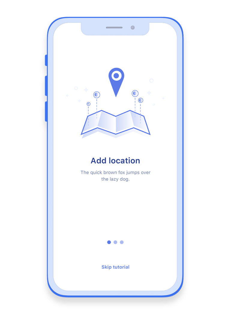
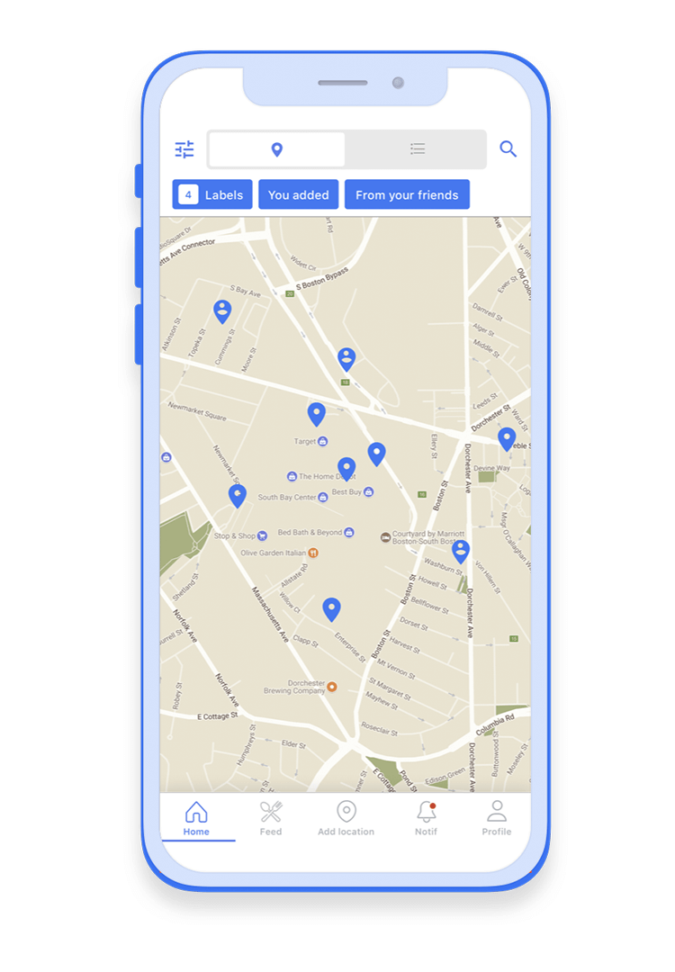
Cleaner visuals
Original Favocity was a combination of white and blue with small fractures of other colors. To keep the app’s identity, we used the same mix of colors but in different proportions.
White is now the dominant color of Favocity. Only the main control elements of each page are blue. The new interface makes interiors and dishes from restaurants stand out more.
Filters
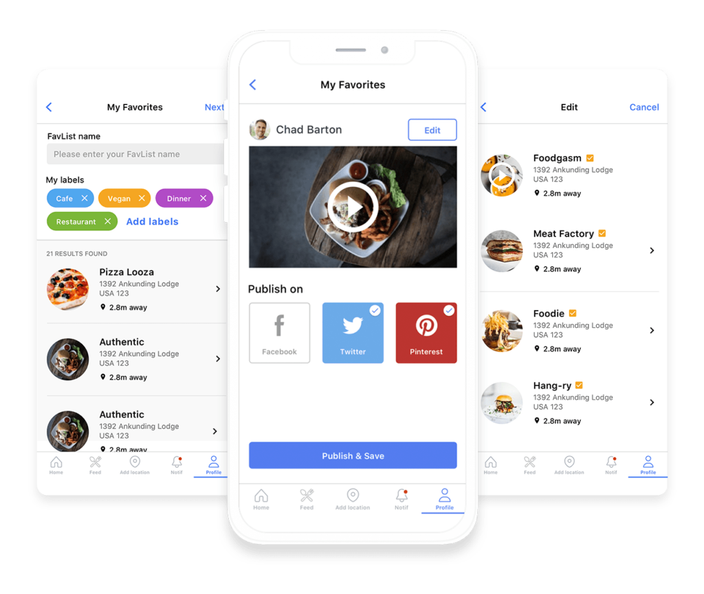
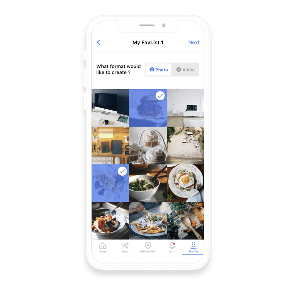
We introduced labels to help you manage your saved places. Assign one to a nice Chinese restaurant you’ve just been too. Next time you want some Asian food you won’t have to waste time scrolling the list. The app has around a hundred standard labels, but you can create your own.
More social features
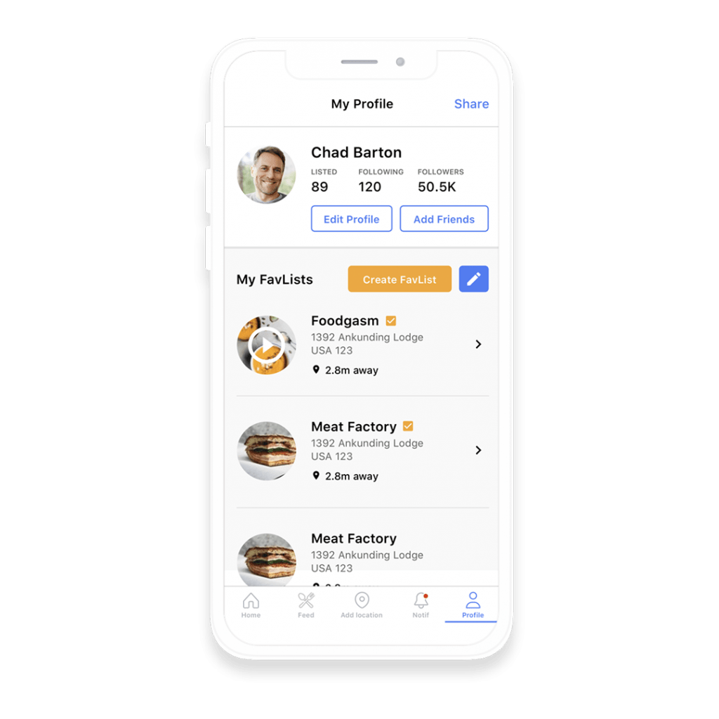
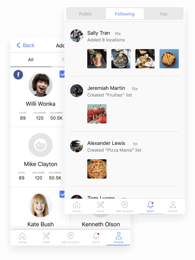
Favocity always had profiles and feed, but before the redesign, it was more of a restaurant guide than a social platform.
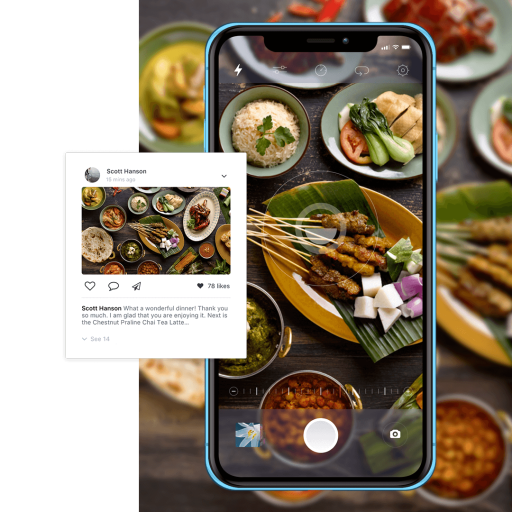
Now, users can chat, leave likes, and publish posts on Facebook, Twitter, and Pinterest.
“Redesigned Favocity looks like a completely new app! At the same time, it remains the Favocity it used to be. Riseapps team knows how to stick to client requirements.”
The outcome
Renewed Favocity looks more appealing, but the main change is in how the app feels.
With the geolocation and a map, finding new places to eat is now much easier.
Social interactions also increase user engagement and make it more enjoyable to remain in the app community.
Want to explore more?
Drop us a line
Contact Us


